How to match your cushion covers to your sofa?
Louis MikolajczakShare
The art of matching cushion covers to your sofa — simple rules for a harmonious living room
In a living room , everything often starts with the sofa : it's the centerpiece, the one that catches the eye and sets the tone for the interior design . But when it comes to choosing the smallest cushion cover , doubt sets in: should you match or contrast? Patterns or plain? How many cushions, and where to place them? This article was designed to remove these hesitations and offer you a clear, easy-to-apply method, with concrete examples, comparisons and visual tips. You'll find a real practical answer here, not generalities. Follow the guide: in just a few steps, you'll know how to match your cushion covers to your sofa to create a cohesive, warm and ultra-personal atmosphere.
Match your covers to the style of your sofa
Start by looking at the style of your sofa . This guide will help you avoid any mistakes and guide your choice of decorative cushions (shapes, materials, finishes). Here are some simple and effective tips:
Scandinavian (straight lines, light wooden legs, pastel shades)
- Choose cushion covers that are plain or have soft geometric patterns.
- Materials: washed cotton, linen, fine knit for a cozy but light feel.
- Colors: light gray, sage, mist blue, blush, with a hint of mustard.
Bohemian (soft shapes, natural fibers, relaxed atmosphere)
- Focus on textures: corduroy , crumpled linen , textured weaves.
- Fringes and embroidery are acceptable, but stick to 2 to 3 details max.
- Palette: terracotta, sand beige, ecru, olive green.
Minimalist (clean volumes, neutral colors, few ornaments)
- Choose plain covers with impeccable finishes.
- Sober textures: twill, fine grain (visible quality, without overdoing it).
- Short palette: black, anthracite, greige, off-white.
Classic chic (generous shapes, fine fabrics, careful details)
- Short pile velvet, discreet jacquards, tone-on-tone piping.
- Deep colors: midnight blue, burgundy, emerald, camel.
- Mix solid color + elegant pattern (fine stripe, subtle checkerboard).
Color harmony: match or contrast?
Color sets the mood. You have two options: matching (similar tones for a calming effect) or contrast (opposite colors to energize the living room ). The secret? A short palette (2 to 3 colors) and thoughtful distribution.

| Sofa color | Recommended covers | To avoid | Final atmosphere |
|---|---|---|---|
|
Light gray
|
mustard beige sage green fine geometric patterns
|
too many identical grays (flat effect) aggressive neon contrasts
|
Bright calm + hot spot (Scandi) |
|
Sand beige
|
terracotta olive green camel
|
pure white in mass (too cold) bright gold (too flashy)
|
Gentle warmth — natural spirit |
|
Midnight blue
|
ecru caramel garnet (keys)
|
solid black (darkens) bright royal blue (competition)
|
Subtle chic + elegant contrast |
|
Forest green
|
unbleached linen mole Honey
|
similar green (all the same) frank red in large quantities
|
Sophisticated, welcoming nature |
|
Anthracite
|
off-white cognac blue gray
|
too much dark (heavy piece) garish metallics
|
Graphic & bright, modern |
|
Camel leather
|
textured ecru slate blue pinkish taupe
|
saturated oranges (overheating) too bright golds
|
Controlled warmth, vintage chic |
A winning 60/30/10 split: 60% neutrals (sofa), 30% similar cushion covers , 10% accents (a bright color, a strong pattern). This ratio gives structure to the whole look without sacrificing boldness.
Focus on materials and textures
Color catches the eye, material commands attention. Alternating textures instantly transforms the perception of the living room : it gains depth and visual comfort. Three families to combine without fear:
- Velvet (short, ribbed): instantly chic, catches the light. Ideal for adding depth to a plain sofa.
- Linen (washed, controlled wrinkles): natural, breathable, very luminous. Perfect in summer, sublime with light wood.
- Wool / thick weave : cocoon-like, visual graininess, warms up a somewhat cold ensemble.
To avoid the "catalogue" effect, stick to two dominant textures + one accent texture. Example: gray sofa in smooth fabric → ecru linen covers (dominant), mustard velvet (accent), and a discreet jacquard to tie the whole thing together. Your cushion covers then become a play of subtle balances, visible even from a distance.
Play with patterns without overloading
Patterns instantly energize a sofa . The most common mistake? Stacking too many. Here's a formula that works every time:
- 1 “hero” pattern (strong stripe, large floral, contrasting checkerboard) — this is the strong piece.
- 1 smaller secondary pattern (micro-stripes, fine dots, subtle chevrons).
- 2 textured solids to make the whole thing breathe.
Maintain a consistent palette between patterns (same colors, compatible intensities). If your rug is already very graphic, choose more modest decorative cushions to avoid saturating the interior design . Conversely, if your room lacks energy, a well-chosen hero pattern will create the effect of a painting.
Number and arrangement of cushions
The right number depends on the size of your sofa and the desired style. Keep these guidelines in mind for your cushion covers :
2-seater sofa
- 2 cushions for simplicity, 3 to add an accent.
- Layout: symmetry (1+1) or asymmetry (2 on one side, 1 on the other).
3-seater sofa
- 4 cushions (balance), 5 if you like generosity.
- Layout: 2+1+2 or 2+3 (higher central stack for the “hotel-like” effect).
Corner sofa
- 6 to 7 cushions depending on depth.
- Make the corner the focal point with the “hero” pattern, then drop the rest into textured solids.

In terms of sizes, mix 50x50 cm (base), 40x60 cm (lumbar) and 60x60 cm (large structuring). Place the largest at the back, the rectangular ones at the front for immediate comfort. Visually, think "triangle": a high point (hero motif), two lower points for support, and an accent that captures the light.
Adapt your decor according to the season
Spring — We're craving light and freshness. Replace dark velvets with washed linen or cotton, add a stylized plant motif (foliage, microflora) and a touch of sage green. If the sofa is gray: ecru linen + sage + a pale yellow accent = immediate softness.
Summer — Make way for breathable and easy-to-wear. Linen slipcovers in shades of sand, misty blue, and ecru. Dare to use a bolder graphic pattern (a wide, seaside-style stripe) if the room is bathed in light. Also consider "ventilated" textures (airy weaves) for a fresh visual effect.
Autumn — Warming up: corduroy, spice tones (honey, cognac, terracotta), textured knits. If your sofa is beige, add a caramel and a terracotta cushion to thicken the palette. A subtle jacquard ties everything together without overpowering it.
Winter — A true cocoon. Keep the textile base (velvet, wool), intensify the depth (midnight blue, forest green, burgundy), and stick to textured solids to avoid weighing things down. A single large-scale pattern is enough to add personality.
Practical cases: find your winning combination
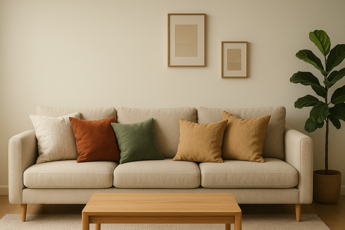
Case 1: Beige sofa, warm atmosphere
Bright neutral base. Combine with ecru linen (50x50), terracotta velvet (50x50), and a secondary taupe chevron pattern (40x60). Distributed 2/2/1 on a 3-seater, with the chevron in the center to tie it together. The result: soft, welcoming warmth, perfect for a natural interior design .
Case No. 2: Anthracite sofa, desire for light
Play with chic contrasts: textured ecru (50x50), cognac velvet (50x50), blue-grey (40x60). Ecru "opens" the whole, cognac warms, blue-grey brings sophistication. Avoid all-black, which is too heavy.
Case No. 3: Midnight blue sofa, chic hotel mood
Ecru (linen), caramel (short pile velvet), secondary tone-on-tone checkerboard pattern. The checkerboard remains discreet but gives a high-end visual grain. A single garnet accent cushion if you like depth.
Case No. 4: Family corner sofa
Corner = focal point: “hero” pattern (wide stripe), around: textured solids (ecru linen, sage velvet, taupe twill). Think comfort: multiply the 40x60 to support the back. In photos, we mainly see the large masses: take care of the palette before the complexity.
Frequently asked questions… and concrete answers
- Should I match my covers to the rug? Not necessarily. Create a dialogue between them through a common color (same beige family, a shared green) or through the material (wool/velvet). The important thing is consistency, not perfect identity.
- What if my living room is small? Choose light solid colors and small-scale patterns. Three to four well-chosen cushions are better than six. Light should circulate.
- How to avoid bad taste? Limit yourself to three colors, keep one “hero” pattern, and make sure each cushion connects to at least one other (color or texture).
Express Visual Guide: Three Combos That Always Work
Bright nature
beige + ecru + sage + Honey
Linen & velvet, 4 or 5 cushions, soft asymmetry.
Chic graphics
anthracite + off-white + cognac
A black & white pattern (dry), a cognac velvet (warmth).
Subdued elegance
midnight blue + ecru + caramel
Matte satin/short velvet, 5 cushions, higher center.
Common Mistakes to Avoid (and Their Solutions)
- Too many cushions of the same size → mix 50×50, 40×60 and 60×60 to create levels.
- Palette too wide → go back to 3 colors, remove what “shouts” without echoing elsewhere.
- Uniform textures → add a “living” material (linen, bouclette, velvet).
As you can see, matching your cushion covers to your sofa isn't rocket science when you have a simple method. By first working on the style, then the palette, then the textures, and finally the layout, you'll confidently structure your interior design . The rest is just fun, adjustments, and seasonality.
5-minute action plan
- Identify the style of the sofa (Scandinavian, minimalist, bohemian, chic).
- Choose a maximum of 3 colors (including 1 accent).
- Set 2 main textures + 1 accent.
- Select 1 “hero” pattern + 1 secondary pattern.
- Decide on the number and arrangement (symmetry or asymmetry).
Maintenance & longevity: covers that stay beautiful
Beauty also lasts over time. To keep your cushion covers impeccable, choose removable textiles, materials suited to real life (washed linen, durable cotton, easy-care poly velvet), and colors designed for your everyday life (children, pets, direct light). Two simple tips:
- Wash dark shades separately the first few times, turning the covers inside out to protect the surface.
- Alternate your seasonal capsules: your fabrics wear out less quickly, your living room is renewed more often.
Visual recap: three golden rules
- Short palette (3 colors) + 1 accent .
- Complementary textures (smooth + textured) for depth.
- Legible composition (visual triangle, various sizes).
If you had to keep only one idea: each cushion must “speak” to another (same color, same material or echo of pattern). It is this discreet mesh that creates harmony.
To go further: personalize without making mistakes
Do you love interiors that tell a story? Add a signature cushion cover : handcrafted embroidery, a deep velvet brought back from a trip, a vintage stripe. It will be your storytelling piece, your emotional anchor. Surround it with textured solids and well-chosen neutrals to set the scene. It's often this detail that makes a sofa truly unique.
Conclusion
To match your cushion covers to your sofa , adopt a four-step method: style, colors, textures, composition. Limit the palette, mix materials, tame patterns, play with sizes. You will obtain a harmonious, lively living room that is easy to change with the seasons. Ready to create your ambiance? Discover covers designed to last and enhance your daily life: Cushion covers .
