
Table setting: the right combinations with a linen tablecloth (and the mistakes that ruin everything)
Louis MikolajczakA table that breathes: the art of combining linen and tableware without making a mistake
Linen is beautiful… but it's also a fabric that doesn't forgive mistakes. A linen tablecloth highlights everything: the color of the plates, the sparkle of the glasses, the finish of the cutlery, and even the centerpiece. In this article, I'll give you a clear method for creating instantly chic combinations (even with simple tableware), and most importantly, I'll point out the common mistakes that ruin the whole look. You'll leave with ready-to-copy color combinations, a summary chart, and a checklist for setting a successful table in 10 minutes.
- Why linen completely changes the atmosphere of a table
- Choosing the right linen tablecloth: color, drape, dimensions
- The rule that avoids 80% of mistakes: “only one star”
- Tablecloth and place setting color combinations: from the simplest to the most elaborate
- Materials and finishes: porcelain, stoneware, glass… how to make them work together
- Glasses and cutlery: the details that make a “restaurant table”
- Napkins, rings, folding: small effort, big impact
- Centerpieces and decor: maintaining style without clutter.
- Summary table: winning agreements and pitfalls to avoid
- Mistakes that ruin everything (and how to fix them)
- 10-minute "perfect table" checklist
- Linen care: avoiding unsightly creases, stains, and unpleasant surprises
- Frequently Asked Questions
- Quick memo
Why linen completely changes the atmosphere of a table
A linen tablecloth is not just “a piece of fabric on the table”. Linen has a vibrant texture, a material that catches the light, folds that are part of its charm… and a natural feel that can make a table ultra-warm or, conversely, a little “bland” if the rest of the table setting doesn't match.
Specifically, flax amplifies three things:
- Contrasts : a plate that is too white on an ecru linen can appear yellowed or “dirty” (even though everything is clean).
- The finishes : a glass that is too thick or a cutlery that is too shiny is more noticeable.
- The volume : if everything is flat (basic service + neutral tablecloth + timid decoration), the whole thing lacks depth.
The right reflex
With a linen tablecloth, you're looking for a balance between softness (natural material) and structure (clean lines, consistent finishes). It doesn't mean "matching everything," it means connecting everything .
Choosing the right linen tablecloth: color, drape, dimensions
1) Colour: think “undertone”, not just “beige or white” 
The number one pitfall is choosing a "neutral" tablecloth without considering its undertone. Linen can lean towards:
- warm (golden beige, sand, ivory)
- cool (greyish ecru, cool off-white, "pebble" linen)
- rosé (champagne, nude)
- green/grey (sage, smoked flax)
Next, your tableware should stay within the same style. You can create contrast, yes, but not a "hot vs. cold" look without a clear intention. That's exactly the kind of detail that makes a table look "odd" without anyone knowing why.
2) The drape: the tablecloth must hold its shape
Linen that's too thin can look flimsy and lack elegance, especially if you want a dressier table setting. Conversely, very thick linen has a magnificent presence, but you have to accept that it has a more structured drape and more pronounced creases.
3) Dimensions: the overhang changes everything
A tablecloth that's too short immediately makes the table look unfinished. A tablecloth that's too long can get in the way of your knees and make the table look visually heavy.
A simple guideline (that almost always works)
Ideal overhang: 20 to 30 cm on each side (a little more if it's a reception table, a little less if it's for everyday meals).
Tip: if you're hesitating between two sizes, choose the larger one for a "dressed-up" table, the smaller one for a "simple and clean" look.
The rule that avoids 80% of mistakes: “only one star”
When a table setting is a failure, it's not because "it's not pretty." It's often because everything is trying to be pretty at the same time .
The simplest rule: choose a single star (an eye-catching element) and let the rest support it.
The 3 easiest “star” options
- Star = the tablecloth : colored linen (terracotta, sage green, charcoal grey) → rather simple service.
- Star = the service : plates with relief, coloured rim, handmade stoneware → rather plain tablecloth.
- Star = the centerpiece : bouquet + candles + materials → more discreet tablecloth and service.
You can have two strong elements only if one is very calm (e.g., terracotta tablecloth + very simple white plates). Three strong elements = high risk.
Tablecloth and place setting color combinations: from the simplest to the most elaborate
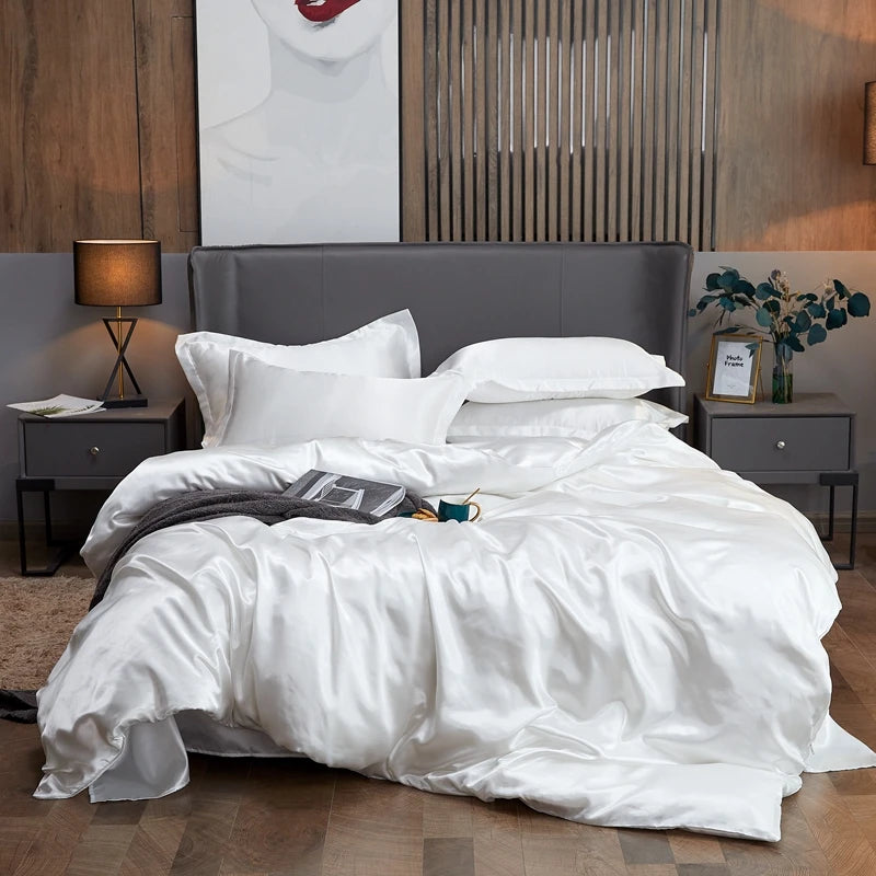
Pairing #1 (easy and chic): natural linen + white porcelain + clear glass
This is a safe bet, but there's one condition: the porcelain must be a consistent white. A bluish white on warm linen can look too "cold." If your set is a very cool white, opt for a grayish-ecru linen or a cool off-white linen.
To add depth: add a small touch of texture (wooden napkin rings, fine jute placemats, ivory candles) or a soft contrast (light grey linen napkins).
Match #2 (ultra-warm): golden beige linen + sand/cream stoneware
If you like natural table settings, this is the perfect match: everything is from the same family, but the textures are different. The stoneware adds depth, the linen brings softness. Here, avoid overly flashy cutlery: brushed stainless steel or a slightly satin finish works better.
Pairing #3 (modern): off-white linen + black or charcoal plates
Very beautiful, very graphic… provided you commit to it fully. If you choose black, own it: a simple centerpiece, thin glassware, and warm lighting (candles, soft lighting). Otherwise, it can quickly look harsh.
Pairing #4 (soft decor): sage linen + ivory plates + lightly smoked glass
Sage green with ivory is simple and refined. Slightly tinted glass (very light gray) can add elegant depth. But be careful: if your plates already have a strong color, keep the glasses clear.
Match #5 (a festive table setting without "overdoing it"): champagne linen with a discreet gold trim
The secret is "discreet." If you have plates with a thin gold rim, champagne or ivory linen is ideal. Don't add a thousand gold accessories: a subtle touch is enough (a spoon, a ring, or a candle).
Avoid this if you want a harmonious table setting.
- Warm linen + very cold white : the whole thing looks yellowish or dull.
- Patterned tablecloth + patterned plates + colored glasses : too much information, the eye gets tired.
- Too many “strong” colours : choose one dominant shade and a small touch, not five.
Materials and finishes: porcelain, stoneware, glass… how to make them work together
Porcelain: the most elegant, the most visually “clean”
Porcelain is ideal if you want a bright and clean table setting. On a linen tablecloth, it brings out a "polished home" feel. If you want to break up the overly classic look, add some texture: crumpled linen napkins, a very simple but natural centerpiece, or slightly more contemporary glassware.
Stoneware: perfect with linen, but beware of "exactly the same"
Stoneware and linen complement each other perfectly because they both have a vibrant feel. The risk: creating a tablescape that's too uniform (all beige, all matte). To avoid this, add something with a subtle sheen: crystal-clear glasses, satin-finish cutlery, or a touch of lighter-colored ceramic.
Earthenware: incredibly charming, but watch out for the patterns
Earthenware (often decorated) can become the star of the table. In this case, opt for a plain linen tablecloth, simple napkins, and a light centerpiece. If your earthenware is very colorful, avoid tinted glassware: it quickly becomes overwhelming.
Glass: the thinner it is, the more high-end the table looks.
It's not mandatory to have "fragile" glasses, but the shape matters: a thin, simple glass instantly elevates the table. On linen, it creates a beautiful tension between the soft fabric and the crisp transparency.
Glasses and cutlery: the details that make a “restaurant table”
Lenses: 2 types are sufficient in 80% of cases
If you want an elegant table setting without overcomplicating things: a water glass and a wine glass . Adding a flute, a cocktail glass, a digestif glass… might look nice, but it quickly clutters the table. And on a linen tablecloth, the clutter is even more noticeable.
Simple tip: if your tableware already has a distinctive look (textured stoneware, embossed plates), choose very simple, clear glasses. If your tableware is very neutral, you can opt for slightly more stylish glasses (taller shape, thinner stem, subtly patterned glass).
Cutlery: choose a finish and stick to it
Cutlery is often where things "go wrong": mixing styles, metals, and finishes. Linen prefers consistency.
- Polished stainless steel : very classic, very bright. Works well with white porcelain.
- Brushed/satin stainless steel : softer, more modern. Perfect with stoneware and natural linen.
- Gold : superb if you keep it minimalist (just one touch of gold, not an explosion).
- Matte black : modern, but to be used with a minimalist table (otherwise it looks harsh).
Simple placement (no fuss)
Left: Forks. Right: Top:
Napkins, rings, folding: small effort, big impact
Linen napkins: the simplest way to "finish" a table
If you already have a linen tablecloth, adding linen napkins (even in a different shade) creates a very cohesive look. The trick: stick to the same color palette. For example:
- Warm beige linen + soft terracotta towels
- Cool off-white linen + pearl grey towels
- sage linen + ivory napkins
Folding techniques that work well without being complicated
3 quick folds (for a “beautiful table” effect)
- The simple rectangle : fold in 3 lengthwise, place in the center of the plate or to the left of the cutlery.
- The loose knot : perfect with (natural) linen. Make a loose knot, not a tight one.
- The ring : slides the rolled-up towel into a ring made of wood, satin metal or ceramic.
"Chic" crumpled linen does exist: the secret is a clean crumpling (not a towel pulled from the bottom of a drawer).
Centerpieces and decor: maintaining style without clutter.
The golden rule: you should see the people, not the bouquet
A centerpiece that's too tall interrupts conversation and gives an impression of "overcrowding." On a linen tablecloth, empty space is a luxury: it allows the table to breathe.
3 easy centerpieces (that go with linen)
- Option 1: candles + a small touch of greenery (2 or 3 candles + a mini vase).
- Option 2: a light table runner (tone-on-tone linen) + low objects (small candle holders).
- Option 3: a low bouquet (style “picked”, not compact) in a simple vase.
The classic trap
Piling things on: bouquet + candles + large decorations + confetti + ribbons… The result: nothing looks good anymore. If you're unsure, remove 30% of the items. The table will look more elegant almost every time.
Summary table: winning agreements and pitfalls to avoid
| Linen tablecloth | Recommended service | Glasses & cutlery | Atmosphere | Avoid |
|---|---|---|---|---|
| Natural linen (warm beige) | Ivory porcelain or sandstone | Clear glass, brushed stainless steel | Warm, authentic | Very cold white, stainless steel too mirror-like |
| Off-white linen (cool) | Cold white porcelain, minimalist plates | Thin glass, shiny stainless steel | Clear, bright | Golden beige + bluish white (bad mix) |
| Sage green flax | Ivory plates, cream stoneware, subtle relief | Clear glass, satin stainless steel | Softness, chic nature | Colored glasses + patterns on plates |
| Terracotta flax/clay | Ecru/ivory plates (plain) | Clear glass, discreet gold accent | Warm, festive | The service was already very colorful, the decor too busy |
| Charcoal grey linen | White porcelain or very simple black plates | Clear glass, satin metal | Modern, contrasting | Cold lighting, too many objects on the table |
If you want to play it “safe”: plain tablecloth + simple tableware + transparent glasses + a single touch (napkin, candle or small flower).
Mistakes that ruin everything (and how to fix them)
Mistake 1: Mixing whites "that don't speak to each other"
On a linen tablecloth, white can quickly appear grey, yellow or "faded". This is not a defect in the tablecloth: it is a clash of undertones.
Solution: maintain a logical approach: cool white with cool linen, ivory with warm linen.
Mistake 2: Too many patterns at the same time
Striped tablecloth + floral plates + colored glasses = clutter. Even if each element is pretty on its own, the whole thing becomes confusing.
Solution: a single strong pattern. The rest in solid colors or "faux-plain" (discreet texture).
Mistake 3: a wrinkled tablecloth that looks "sad" (not "chic" wrinkled)
Chic wrinkles are controlled wrinkles: a clean tablecloth, a vibrant fabric, soft creases. Sad wrinkles are those that look like they've been pulled straight from the basket.
Solution: a quick steam iron or drying laid flat + neat folding. And above all: a perfectly clean tablecloth (linen stains).
Mistake 4: Centerpiece too high or too bulky
You can no longer see people, you no longer know where to put the dishes, and the table becomes “logistics”.
Solution: low and light. Thin candles + small vase, or low bouquet.
Mistake 5: Overly shiny cutlery with a very natural table setting
Natural linen + matte stoneware + mirrored cutlery: it can look like an "added piece".
Solution: brushed or satin stainless steel to maintain a soft look.
Error 6: Too many objects, not enough space
When there is no empty space, the eye can no longer "breathe". An elegant table always has areas of calm.
Solution: remove 30% of the decor, then reassess. Often, it works wonders.
| Error | Why does it ruin it? | Simple solution | Upgrade option |
|---|---|---|---|
| Tablecloth too short | Gives an “unfinished” impression | Add a table path for structuring | Choose the next size up (overhang 20–30 cm) |
| Incoherent whites | Everything seems tarnished | Replaces one item: napkins or plates | Stay in a hot/cold family |
| Too many patterns | Visual overload | Keep one pattern, make the rest plain | Use a textured "faux-plain" instead of a pattern |
| Tall centerpiece | Blocks the view, obstructs the food | Lower vase + thin candles | Low composition in odd number (3 elements) |
| Cutlery too shiny | It clashes with natural linen | Satin/brushed stainless steel | A discreet metallic accent (ring, candle holder) |
When in doubt: simplify. Linen loves well-thought-out simplicity.
10-minute "perfect table" checklist
The express method (recommended order)
- Lay the tablecloth down and adjust the overhang (visually, this is the base).
- Choose the star (tablecloth / service / centerpiece). Only one.
- Place the plates : aligned, centered, evenly spaced from the edge.
- Add the cutlery : same finish, neat placement.
- Add the glasses : 2 types are enough (water + wine).
- Add the napkins : simple folding, neat, consistent with the tablecloth.
- Centerpiece : low, light, leaves space.
- Final check : removes an object if the table appears full.
Bonus: warm light (candles or soft lighting) makes linen look instantly more beautiful.
Linen care: avoiding unsightly creases, stains, and unpleasant surprises
Before first use: remember to wash
Linen can stretch or shrink slightly depending on the weave. A gentle first wash will help "stabilize" the tablecloth and give you a better idea of how it hangs on the table.
Anti-stain treatment: react quickly, but without rubbing like crazy
A stain on linen happens. The mistake is rubbing too hard: you can damage the fiber.
- Dab (do not rub) with a clean cloth.
- Rinse with lukewarm water if possible.
- Wash quickly on a gentle cycle if the stain persists.
The "chic crinkle" of linen: how to achieve it
Lay the tablecloth flat (or on a wide hanger), shake it lightly before it dries, then fold it neatly. If you want a crisper finish: a quick steam is enough, without aiming for perfect rigidity.
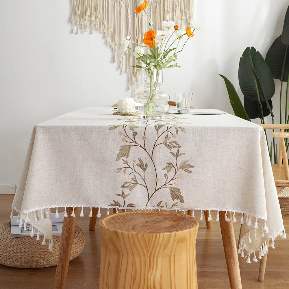
Looking for inspiration to create a beautiful table setting throughout the seasons? Discover our selection of tablecloths and build an easy-to-coordinate base.
Frequently Asked Questions
Does a linen tablecloth go with a very simple everyday table setting?
Yes, and it's actually one of the best ways to make a table look "beautiful" without buying a new set. Keep the dishes simple, focus on the napkins and a light centerpiece. Linen does the rest.
Which linen tablecloth color is the easiest to match?
Natural linen (warm beige) and off-white are the most versatile. Choose primarily according to your service: warm undertones with warm tones, cool undertones with cool tones.
Can porcelain and stoneware be mixed on the same table?
Yes, if you maintain color consistency and limit the "stars". For example: porcelain dinner plates + stoneware dessert plates, plain tablecloth, clear glasses.
How to create a festive table setting without overcrowding it?
Choose one statement piece (candles, colorful napkins, or a rim on the dishes), then keep the rest very simple. Two statement elements maximum, and leave some empty space on the table.
Does linen need to be ironed?
Not necessarily. Crinkled linen can look beautiful if the tablecloth is clean and properly laid. If you want a crisper look: use light steam or a quick iron, without aiming for perfect stiffness.
Quick memo
- Look at the subtones : warm with warm, cold with cold.
- A single star (tablecloth, service or centerpiece).
- Two types of lenses are sufficient most of the time.
- A clean cutlery finish and you stick to it.
- Low centerpiece + empty space = more elegant table.
- When in doubt: remove 30% of the decoration.